You have 8 seconds.
That's it. Eight seconds to grab your audience before they mentally check out, reach for their phone, or start thinking about lunch. Less time than it takes to brew coffee. Shorter than a goldfish's attention span. And shrinking every year. Welcome to 2026, where attention is the world's most valuable currency, and most presentations are bleeding it dry.
The Attention Crisis is Real
Let's start with the uncomfortable truth: we're losing the ability to focus.
The average human attention span dropped from 12 seconds in2000 to just 8.25 seconds today. That's a 33% decline in two decades.We're not just distracted, our digital environment fundamentally rewires us. Screen-based attention? Even worse. Back in 2004, we could focus on a screen for 2.5 minutes before switching tasks. Today? Just 47seconds. That's not a typo. Forty-seven seconds.
Your audience isn't ignoring you because they're rude or uninterested. They're drowning. The average person encounters 247 marketing messages daily, receives 121 emails, and battles a constant stream of notifications. Their brains have shifted into survival mode, ruthlessly filtering out anything that doesn't immediately grab them. And here's the kicker: this isn't getting better. It's accelerating.
Why This Should Terrify Every Business Leader?
Think about the last presentation you sat through. How many slides in before your mind wandered? How many times did you glance at your phone?
Now flip the script. When you're presenting -whether it's a quarterly review, an investor pitch, or a new strategy rollout- your audience is doing the same thing. If your opening slide is a wall of text, you've already lost. If your first 8 seconds don't command attention, the next 40minutes don't matter. In Dubai's boardrooms, pitch meetings in DIFC, or virtual conferences connecting teams across the GCC, your audience is making split-second decisions about whether you're worth their increasingly scarce focus. The stakes? Higher than ever. A lost pitch. A misunderstood strategy. A product launch that falls flat. All because your presentation couldn't win those critical first 8 seconds.
The Science Behind the Scroll
Why has attention collapsed so dramatically?
1-Information overload: Our brains weren't designed for the volume of data we encounter daily. We've hit cognitive saturation, so our minds have adapted by becoming incredibly efficient at deciding what to ignore.
2-The smartphone effect: We check our phones an average of 96 times per day. That's once every 10 minutes during waking hours. We're training our brains to expect constant novelty and instant gratification.
3-Multitasking culture: We don't single-task anymore.We juggle screens, conversations, and thoughts simultaneously. Our attention doesn't disappear; it fractures into micro-moments.
What does this mean for presentations? Your slides are competing with everything else demanding attention. And unless you design for this reality, you're fighting a losing battle.
What Doesn't Work Anymore
Let's be brutally honest about what killed presentations in2025:
Bullet point overload. When everything is important, nothing is. Dense slides full of text don't inform, they overwhelm. Generic stock photos. That handshake photo? That diverse team smiling at a laptop? Your audience has seen it a thousand times.It's visual wallpaper. Linear, predictable flow. When your audience can anticipate every next slide, they disengage. Surprise and novelty are attention magnets. Forgettable openings. "Hello, my name is..."or "Today I'll be talking about..." is the fastest way to lose a room. Your first slide should make people sit up, not settle in.
Design That Wins the 8-Second Battle
So how do you fight back? How do you create presentations that command attention in an era where focus is the ultimate luxury? Here's how we approach it at Rekarda:
1. Bold First Impressions
Your opening slide isn't just an introduction; it's a hook.It should stop the scroll, interrupt the mental chatter, and demand: "Pay attention. This matters."
We're talking big visuals. Minimal text. One clear, provocative idea that makes people lean in instead of tuning out. Think: a striking image that raises a question. A bold statistic that challenges assumptions. A single powerful word that promises value. Not: "Q3 Financial Review" with your company logo.That's not a hook. That's white noise.
2. Motion That Matters
Static slides went invisible in 2025. Your brain is wired to detect movement; it's a survival instinct. Strategic animation isn't decorative; it's directional. Use motion to guide attention exactly where you need it.Reveal data progressively instead of dumping it all at once. Transition between concepts with intention, not default slide wipes. But here's the key: every animation should have a purpose.If it doesn't enhance understanding or guide focus, it's just noise.
3. Contrast, Not Clutter
The human eye gravitates to what stands out. High-contrast colours. Unexpected layouts. Bold, oversized typography. These aren't aesthetic choices, they're attention architecture. When done right, contrast creates a visual hierarchy that tells your audience: "This is what matters most. Look here." Clutter does the opposite. It scatters attention, creates cognitive friction, and makes every element compete for focus. The result?Nothing wins.
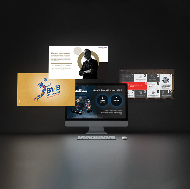
4. Visual Storytelling Over Data Dumps
Numbers don't tell stories. Context does. Instead of showing a table with 20 data points, show the one number that matters most, then explain why it matters. Use visuals to create a narrative, not just display information. A well-designed chart doesn't just show data. It reveals insight. It answers the "so what?" before your audience has to ask.
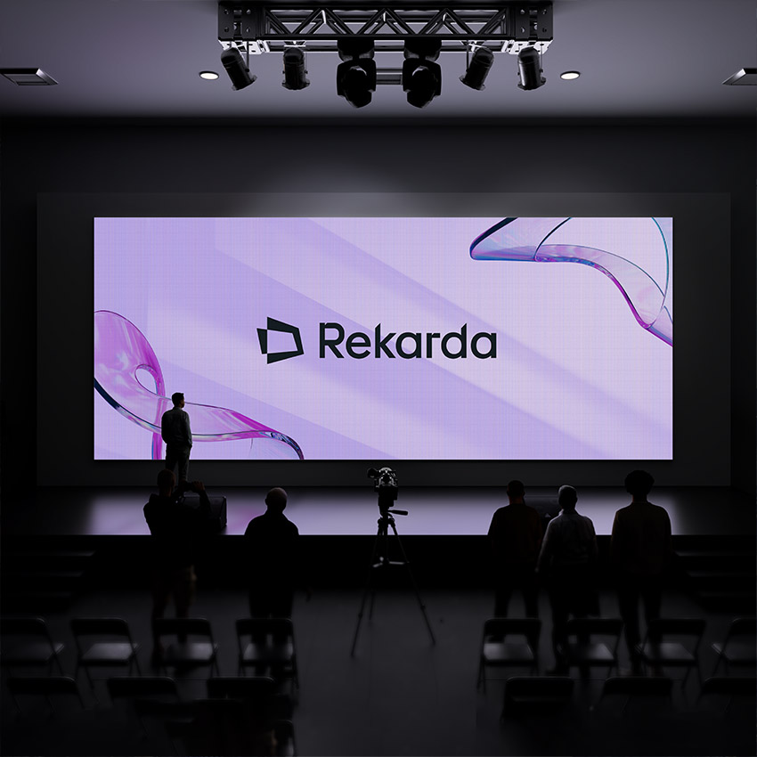
The Rekarda Approach
When clients come to us, they often bring presentations that are technically accurate but visually forgettable. The information is there.The strategy is sound. But it doesn't land. Our job isn't to make things pretty. It's to make them impossible to ignore. We obsess over those first 8 seconds. We design openings that interrupt patterns and demand attention. We use motion, contrast, and storytelling to create presentations that don't just inform, they captivate. Because in 2026, good information won’t be enough. It needs to be delivered in a way that respects your audience's attention constraints while maximising comprehension and retention.
The Bottom Line
You can't control shrinking attention spans. You can't reverse two decades of digital rewiring. You can't make your audience put away their phones. But you can control whether your presentation earns thoseprecious 8 seconds, and the 47 that follow. Great design doesn't just look good. It fights for focus. It commands attention. It respects the reality that every second of attention is a gift your audience chooses to give you.
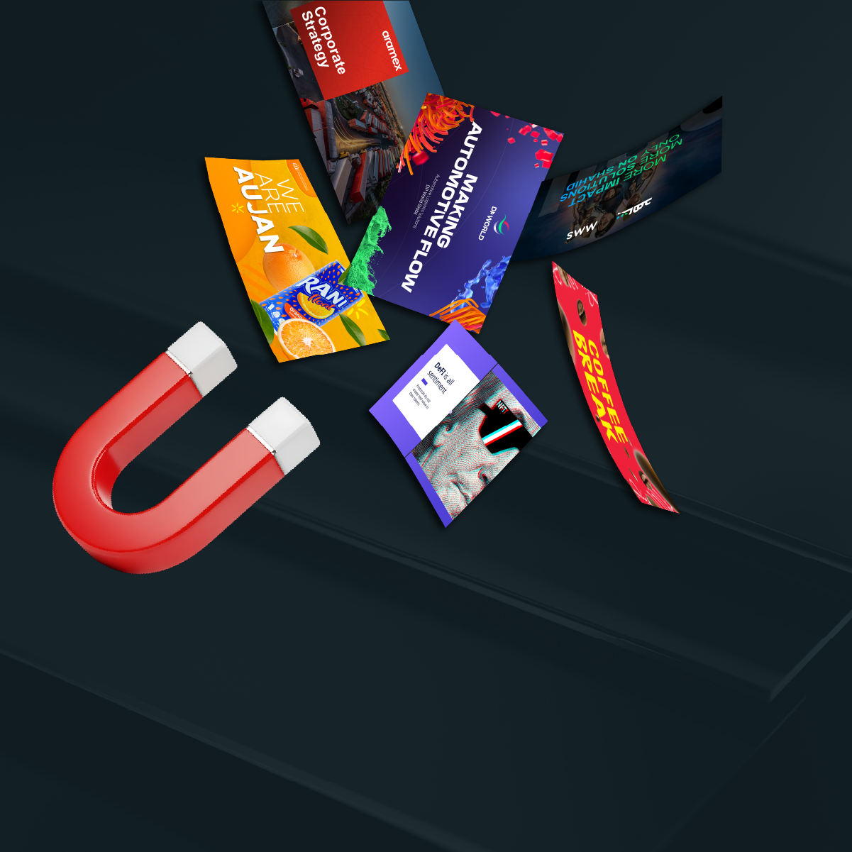
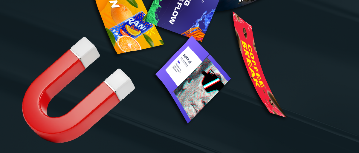
At Rekarda, we don't design presentations. We design attention magnets.