At major conferences and boardroom summits, your slides say as much as your speaker. They signal professionalism, clarity, and confidence—or they don’t. For enterprise brands and government entities, a generic event deck isn’t just ineffective—it’s off-brand.
At Rekarda, we craft event presentations that feel like a true extension of your leadership. Here’s how to ensure your next deck doesn’t just support your message—it elevates it.
1. Align Visual Tone with Brand Identity
An executive presentation is an extension of your corporate voice. A minimal, elegant deck with confident typography and disciplined use of space can convey authority, while a dynamic, motion-led format might suggest innovation and forward momentum. Whatever your brand stands for, your visuals should echo it.
Example: For a multinational tech client presenting at Mobile World Congress, we stripped back the visual noise, leaned into the brand's monochromatic palette, and used kinetic text animations to reinforce key product messages. The result? A deck that felt cinematic, not corporate.
2. Design for Spoken Delivery, Not Silent Reading
C-suite speakers don’t need slide prompts—they need design support. One idea per slide. Strategic pacing. Impactful transitions. When visuals are paced with intentional rhythm, they can elevate a speech from good to unforgettable.
Reference: TED speaker Nancy Duarte has long emphasized the importance of designing "supporting visuals" rather than redundant slide mirrors. Her book Slide:ology is a strong foundational reference.
3. Build for Flexibility and Multilingual Needs
For governmental and international presentations, adaptability is crucial. Slides should be easily versioned for different audiences, whether that means translating content or adapting for simultaneous interpretation.
Tip: Build decks with editable templates, use live interpretable icons, and avoid culture-specific metaphors or idioms.
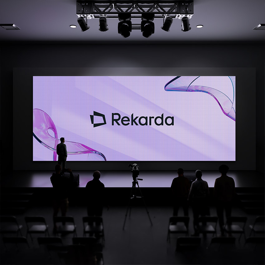
4. Consider Stage and Screen
A presentation that looks great on your laptop may fall flat on a 30-foot LED wall. Design with spatial scale in mind: large fonts, high contrast, and animations that breathe. Motion should support clarity, not distract from it.
Example: For a government client’s economic forum keynote, we tested slides on a mock projection setup to ensure legibility and visual hierarchy at distance.
5. Treat the Deck as a Strategic Asset
The most impactful presentations don’t just inform—they persuade. Your event deck should tell a story that moves the room. Not just what you do, but why it matters now.