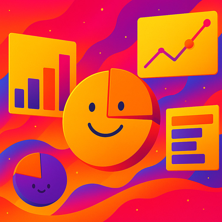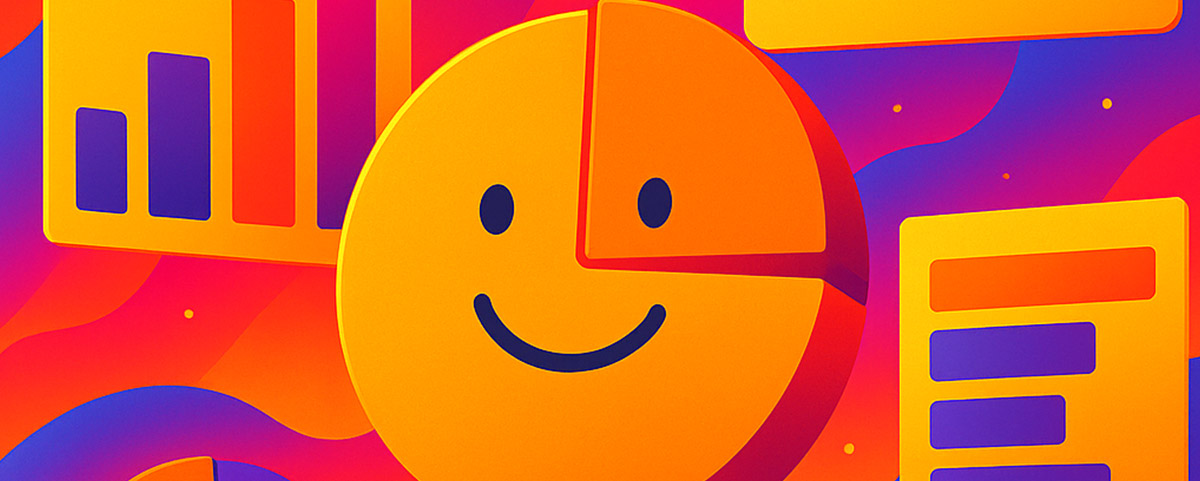
Let’s be real—most charts are soul-crushingly boring. Bar after bar, pie after pie, line after line… yawn. Numbers may tell a story, but the way they’re presented often kills it. At Rekarda, we believe data should feel alive, cheeky, even a little rebellious. Because when numbers have personality, people pay attention.
Here’s how to humanize your charts so your audience doesn’t just see the data—they feel it.
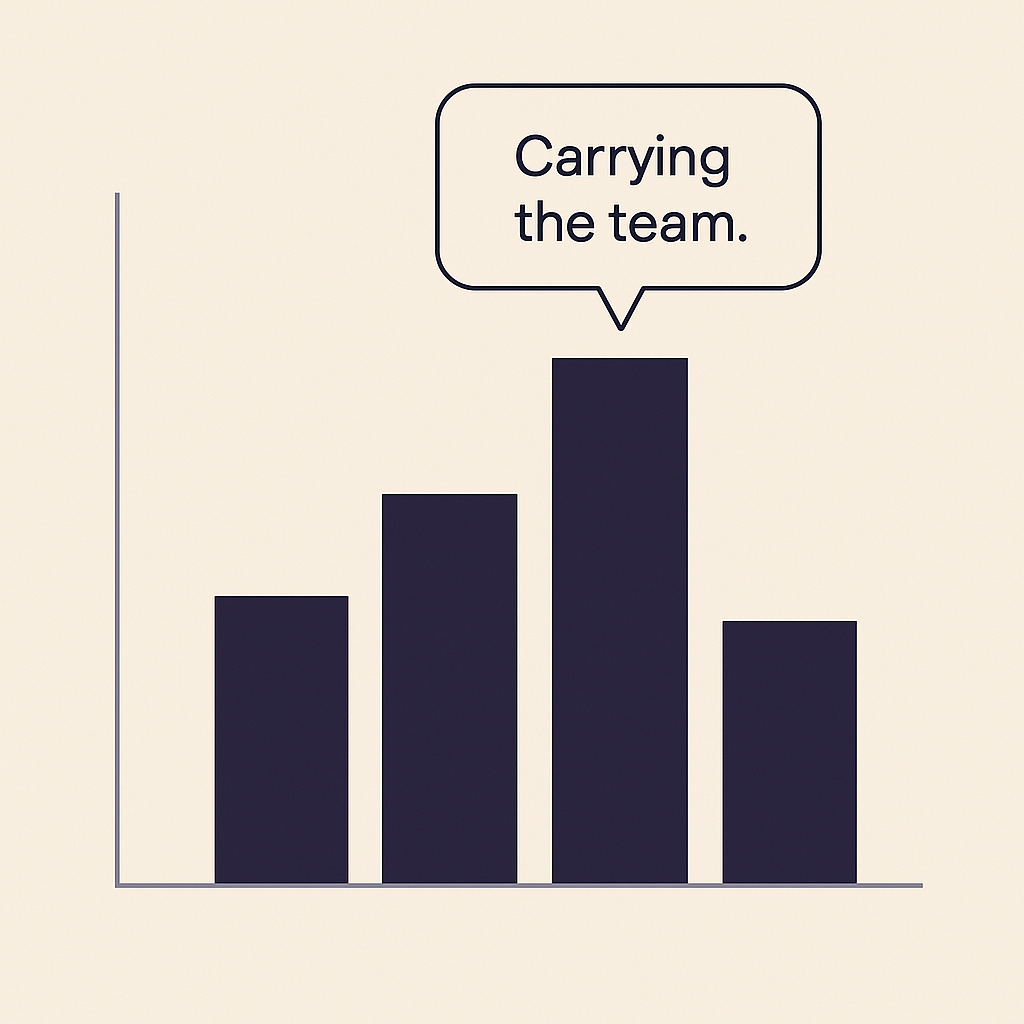
1. Add a Voice (Literally)
Instead of a silent chart, imagine a bar graph where the tallest bar has a small speech bubble: “Yep, I’m carrying the team.” Or a pie chart slice with a cheeky “Guess who’s eating the market share?” It’s a wink at the audience, and it makes data less intimidating.
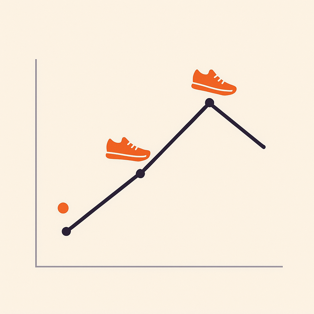
2. Illustrate with Micro-Icons
Who says your chart markers have to be circles or squares? Replace them with tiny illustrations—a sneaker for sales of sportswear, a burger icon for fast-food revenue, or even quirky little faces. Icons turn abstract numbers into relatable stories.
3. Animate the Punchline
Static charts are fine—but motion can deliver the punchline. Imagine a revenue bar growing in front of the audience, or a shrinking competitor’s slice of a pie chart slowly fading away. Motion emphasizes momentum—it’s storytelling with rhythm.

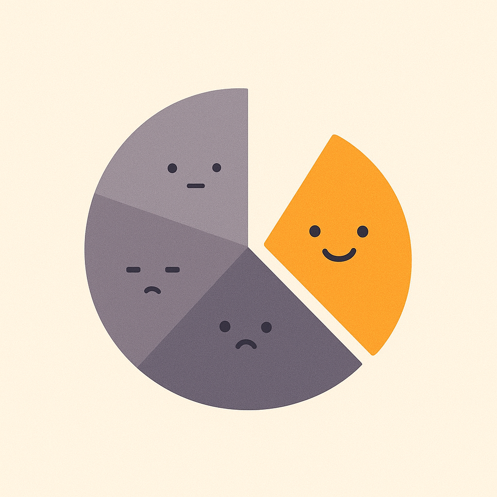
4. Color Code with Personality, Not Just Logic
Skip the corporate blue palette. Make the winning data point electric yellow, or give a failing metric a sad, moody gray. Colors aren’t just aesthetic—they’re emotional triggers. Use them deliberately to make the story obvious at first glance.

5. Design Charts as Characters
Take it all the way: give your chart a character arc. Picture a stacked bar chart with each section illustrated as characters working together—or competing. Numbers become characters in a mini-drama, not just digits.
The Rekarda Rule
Data is serious. But serious doesn’t have to be sterile. When you give charts a voice, a vibe, or a wink, you’re not just presenting numbers—you’re staging a performance. And that’s how you make audiences remember your story, not just the statistics.
Ready to turn your data into something unforgettable? Let’s design charts that talk, wink, and maybe even dance. Get in touch with Rekarda and let’s humanize your next presentation.