A presentation can look current without helping anyone understand it. A fashionable layout can make a message clearer, or simply give the audience another thing to decode.
As corporate teams plan their presentations for 2027, the useful question is not simply “What will look new?” It is “Which visual approaches will make our information easier to follow, more distinctive and more effective?”
These are six presentation design directions we believe are worth watching in 2027: oversized typography, bento grids, editorial layouts, layered imagery, focused data visualisation and seamless motion. This is an editorial outlook, not a prediction that every approach will become mainstream. The examples illustrate established techniques, not work created in 2027 or proof of future adoption. Their value lies in how thoughtfully teams apply them to real communication challenges.
1. Oversized typography: let the message become the visual
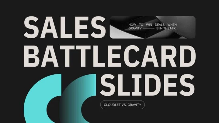
A short statement set at a large scale can carry a slide without a supporting stock photograph, decorative icon or complex background. The words themselves establish the visual hierarchy.
The technique works through contrast: large versus small, bold versus restrained, and a dominant message surrounded by enough space to give it emphasis. It also forces a useful editorial decision. If the headline cannot fit without becoming a paragraph, the message may need more work.
Where it works and where it does not
Use it for an opening proposition, a section transition or the conclusion the audience should remember. Avoid making every slide a giant slogan. Detailed comparisons and technical explanations still need an appropriate content structure.
2. Bento grids: organise variety without losing structure
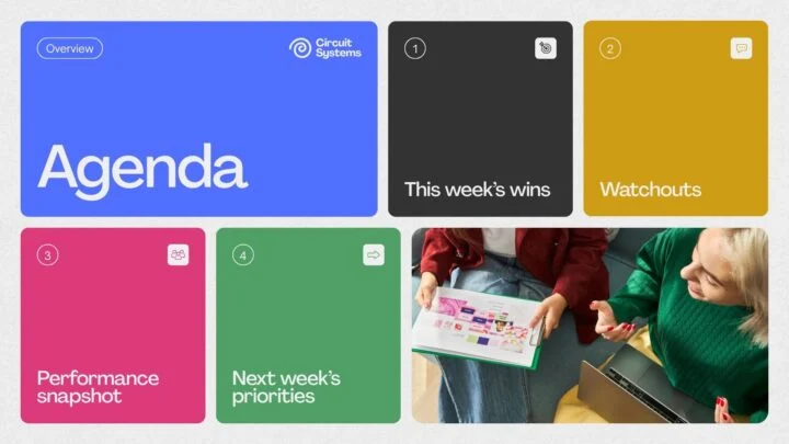
Bento layouts divide a slide into modular containers of different sizes. One card might hold a number, another a short explanation and another an image. A consistent grid makes the elements feel related even when their content differs.
The useful principle is not simply rounded corners. It is grouping: helping the audience recognise which information belongs together and which element deserves the most attention.
Where it works and where it does not
Consider it for capability overviews, product features or a small set of related performance indicators. Give the most important item more space. If every card contains a paragraph, the result is still a crowded slide—just divided into boxes.
3. Editorial layouts: borrow the discipline of print design
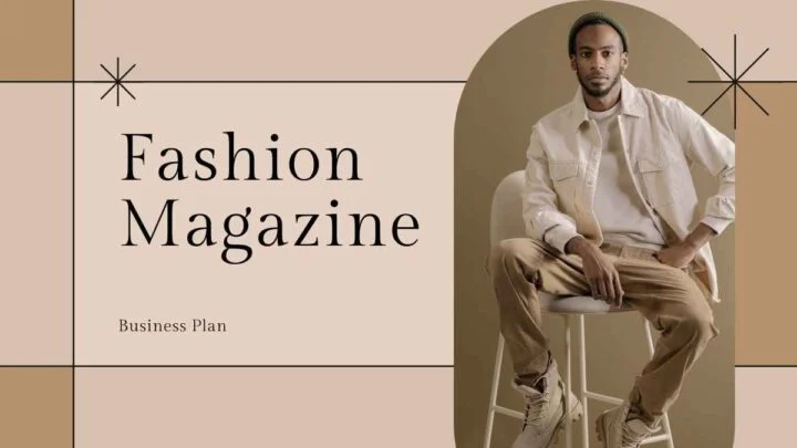
Editorial-style slides combine considered typography, controlled spacing and purposeful image placement. Instead of treating each slide as a container to fill, the designer builds a composition with a clear reading order.
Serif and sans-serif type can provide contrast, while small labels and restrained accents create a consistent structure. The effect depends more on proportion and restraint than on using a particular font.
Where it works and where it does not
This approach can suit company profiles, strategy narratives and brand presentations. But do not copy the density of a magazine page onto a screen. A slide projected across a room needs larger text and less content than a document read at a desk.
4. Layered imagery: create depth without a 3D scene
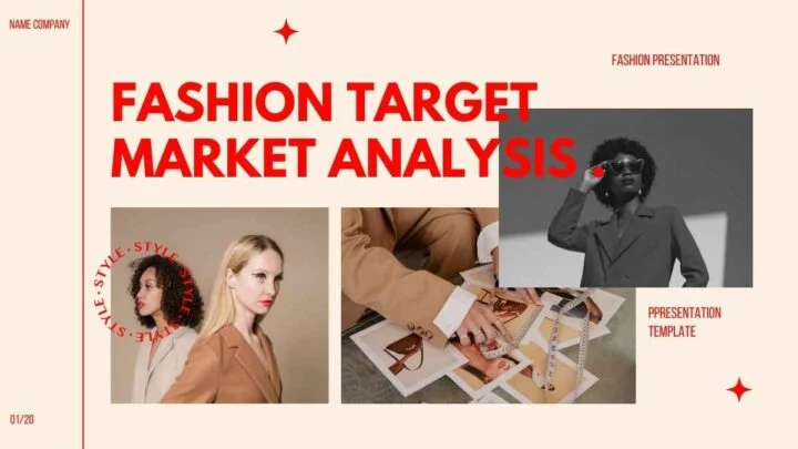
Placing a cut-out subject in front of part of a headline can make a flat slide feel more dimensional. The composition has a foreground and background, even though it is built from ordinary images, text and shapes.
The strongest applications use overlap deliberately. The audience should still read the message immediately; the layering should create a focal point rather than a puzzle.
Where it works and where it does not
Use it selectively for speaker introductions, campaign stories and opening slides. Check the quality of cut-out edges and maintain strong text contrast. Do not hide important letters behind the subject or apply the treatment to slides that need straightforward technical clarity.
5. Focused data visualisation: make the insight visible
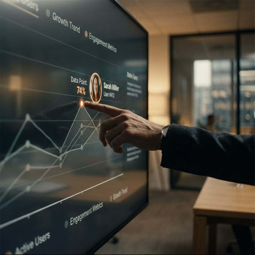
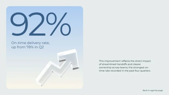
A chart does not become more informative because every series has a different bright colour. When everything competes for attention, the audience has to decide what matters before it can understand the argument.
A focused approach makes supporting information quieter and reserves emphasis for the relevant comparison. A clear headline, a direct label and a short annotation often do more work than decorative effects.
Where it works and where it does not
This is useful for financial updates, operational reviews and performance presentations. Keep the context needed to interpret the result fairly: simplification should not conceal an inconvenient comparison or distort the scale. Our guide to data storytelling in presentations explores how to connect the evidence with the message.
6. Seamless motion: connect ideas instead of decorating them
Motion is most useful when it explains a relationship: an overview becomes a detail, a process advances to its next stage, or an object stays visible while the surrounding information changes.
The audience can follow the same element through the sequence rather than repeatedly reorienting itself. That continuity is a more useful design objective than adding a different transition to every slide.
Where it works and where it does not
Consider motion for process explanations, product walkthroughs and selected keynote sequences. Test playback on the actual presentation setup, keep the pace comfortable and make sure the static version remains understandable. Avoid relying on movement alone to communicate essential information.
How to choose a style that belongs in your presentation
Do not combine all six techniques simply because they are available. Start with the message, the audience and the viewing conditions. Then decide which treatment earns its place.
- Does the technique make the information easier to understand?
- Does it fit the organisation’s brand and the seriousness of the subject?
- Will it remain readable on the screen and in any shared document?
- Can the team update the presentation without breaking the design?
- Does the example demonstrate a useful principle, or are we copying its appearance?
A design system should allow enough variety to support the story without making each slide feel unrelated. When content becomes too dense, the answer may be to restructure it rather than squeeze it into a more fashionable layout. See how to shorten a presentation without weakening its message.
How Rekarda stays ahead of the curve
Staying ahead is not about being the first to use a particular font or effect. It is about understanding what a technique can achieve, where it belongs and how to make it work in a real business presentation.
Rekarda’s work is centred on large enterprises. That brings direct exposure to the challenges behind the slides: complex content, multiple stakeholders, demanding brand requirements and presentations that need to be maintained by internal teams.
With over 20 years of design experience, Rekarda’s founder and creative director brings a perspective that goes beyond the latest visual treatment. The question is not only whether an idea looks good, but whether it helps the organisation communicate and remains practical for the people using it.
Our approach is to bring that context into design decisions: use visual emphasis to clarify priorities, choose motion that supports the narrative, and adapt the treatment to the brand rather than force the brand into a trend. The ambition is a presentation that feels current because it is thoughtfully designed, not because it contains every fashionable effect.
Let’s make your next presentation work harder
If your presentations need a clearer story, a more distinctive visual direction or a better way to communicate complex information, let’s discuss what your team is working on.
Get in touch with Rekarda to discuss your next presentation.