المحتوى كان قويًا، لكن التصميم لم يعكس شخصيتهم الجريئة والمرحة. التحدي؟ إيجاد التوازن المثالي بين اللمسة الإبداعية والصقل المهني، ضمن قالب PowerPoint قابل للتعديل.
The presentation needed to cover several areas of the business without allowing one section to feel separate from the wider company story.
Operational updates, sales performance, financial information and company achievements all required different ways of being presented. At the same time, they needed to feel connected and contribute to one coherent overview of the year.
The structure also needed to remain comfortable for the CEO. The objective was not to introduce an unfamiliar way of presenting, but to strengthen the existing direction through better flow, clearer information hierarchy and a more confident visual experience.
منهجية Rekarda: إعادة تصميم ترتكز على الهوية، وتجرؤ على التفرّد
انغمسنا في عالم Hello Social، واستوعبنا صوتهم البصري، ونمط حركتهم، وأسلوب تواصلهم. لم يكن الهدف مجرد إضفاء جمالية على العرض، بل تصميم PowerPoint يجسّد روح العلامة بكل وضوح.
حركات خفيفة، تأثير قوي
أضفنا مجموعة جديدة من الحركات للعنوانين، واقتصاصات الصور، والانتقالات التي منحت كل قسم حضورًا خاصًا—دون أن تطغى على المحتوى. كل حركة كانت مدروسة، هدفها توجيه الانتباه وتعزيز الرسالة.
The CEO already had a clear understanding of the areas that needed to be discussed and the order in which they wanted to present them. Rekarda retained that foundation while improving the transitions, pacing and relationship between individual sections.
This ensured the final presentation felt natural to deliver while giving the audience a clearer and more consistent experience from beginning to end.
هوية بصرية تنبض بالحياة
من الخطوط المرحة إلى التنسيقات غير التقليدية، حرصنا أن يعكس كل عنصر بصري لغة Hello Social. حافظنا على اتساق التصميم عبر جميع الشرائح، لنقدّم رحلة بصرية ممتعة وفعّالة في آنٍ واحد.
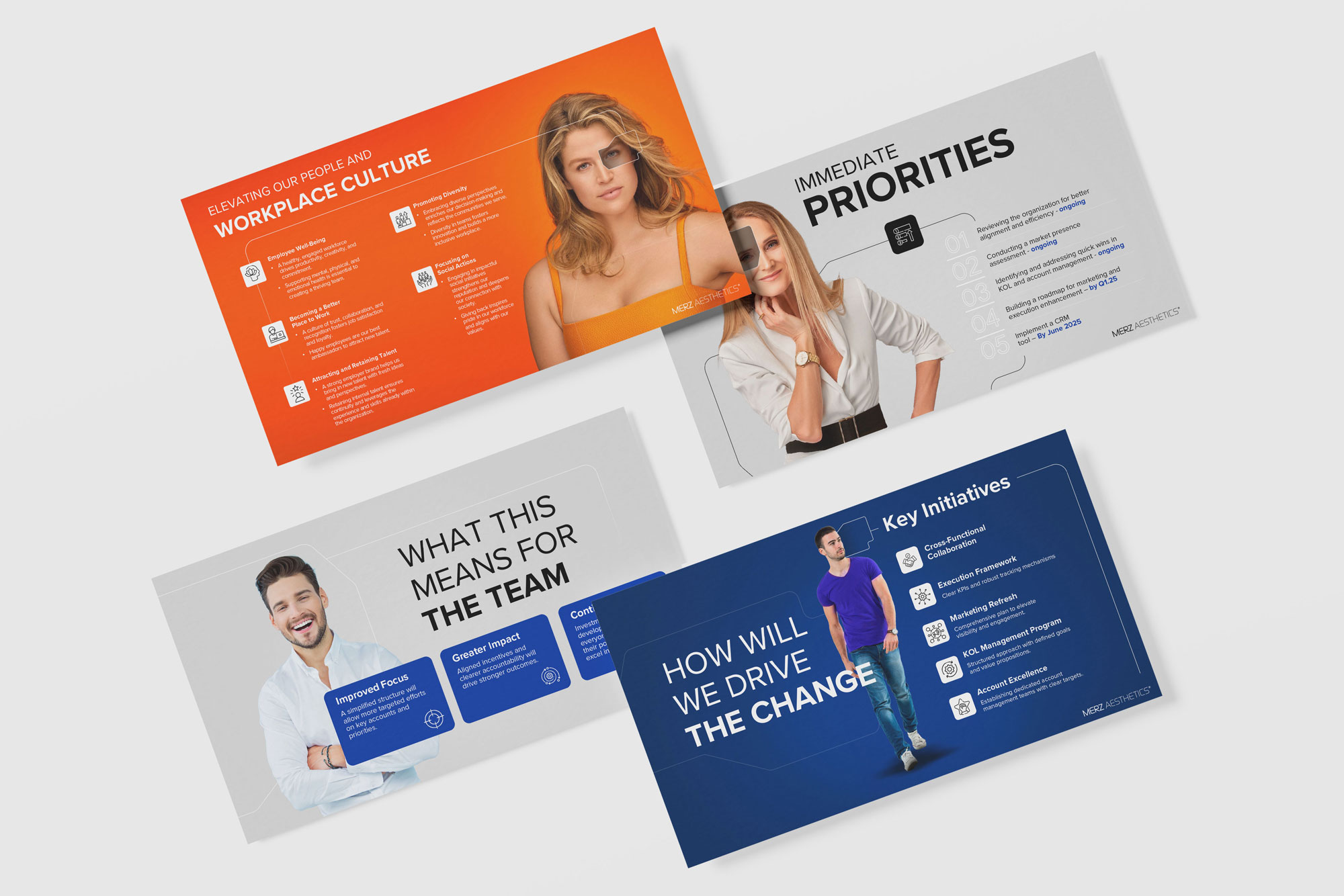
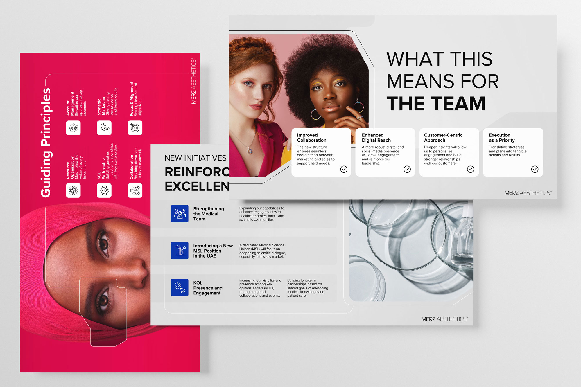
Rekarda established a stronger information hierarchy across the deck, helping the audience distinguish between headline results, supporting figures and additional context.
Important achievements were given the visual prominence they required, while detailed operational, sales and financial information was organised into layouts that made the content easier to read and follow.
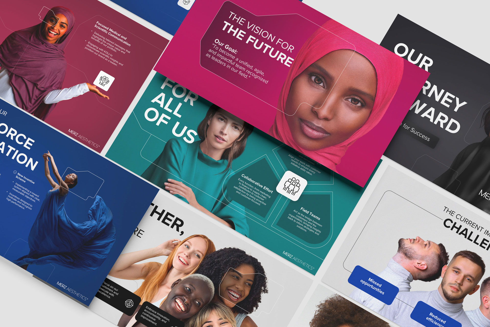
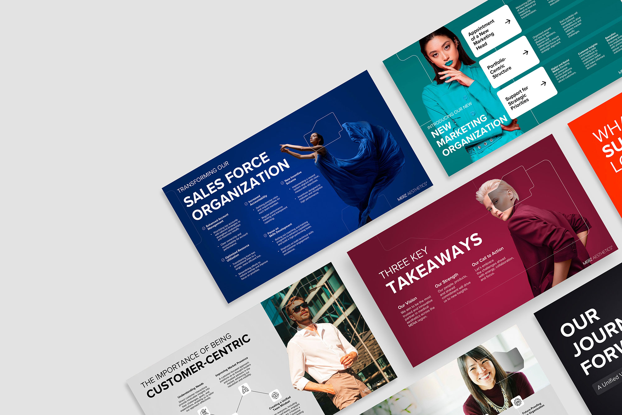
Translating the Merz Aesthetics Brand into PowerPoint
The supplied content had not yet been developed into a branded presentation system. Rekarda studied the Merz Aesthetics identity to understand how its visual language could work effectively within PowerPoint.
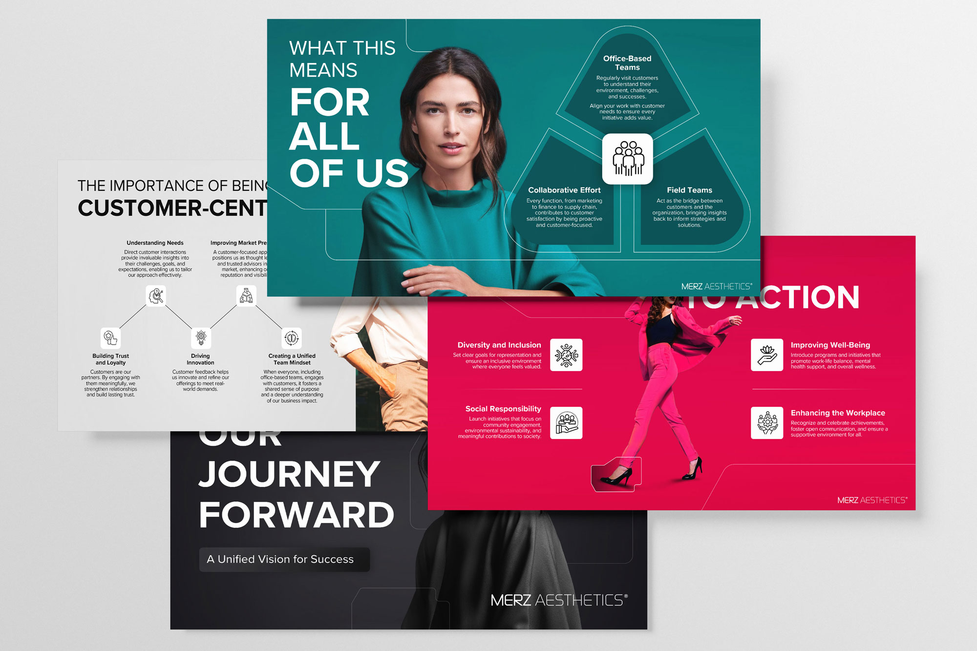
Typography, colour, imagery, composition and supporting graphic elements were adapted to create a presentation style that felt recognisably connected to the company while remaining appropriate for an executive corporate audience.
This gave the presentation a strong Merz Aesthetics identity without allowing the design to compete with the information being communicated.
النتيجة: عرض يُبهر
بلا ضوضاء
النتيجة كانت عرضًا بعيدًا كل البعد عن العادي—نابض بالألوان، متّسق مع العلامة، ومليء بالشخصية. والأهم؟ أصبح أداة تُمكّن Hello Social من تقديم أعمالها بثقة. عميل سعيد، عرض مميز، وتجربة جديدة تثبت أن PowerPoint يمكن أن يكون مختلفًا تمامًا.
Operational results, sales, financial information and company achievements were brought together within one structured executive narrative. The improved flow and hierarchy made the content easier to navigate, while the visual system gave every section a consistent and confident Merz Aesthetics identity.
The result was an executive corporate presentation designed around the CEO’s preferred way of communicating and prepared to represent the company’s progress clearly to the wider organisation.


